Working with what you have can sometimes be a challenge in a renovation when you have a bathroom layout that doesn’t utilize space and laundry that can barely fit a washer and tub. But both the bathroom and laundry only had the budget for a cosmetic makeover, meaning nothing structural was changing. So everything about this renovation is about problem-solving space solutions and restoring the potential of what we already had. In this blog, we share images of the end result, as well as a breakdown of the cost for every detail we added.
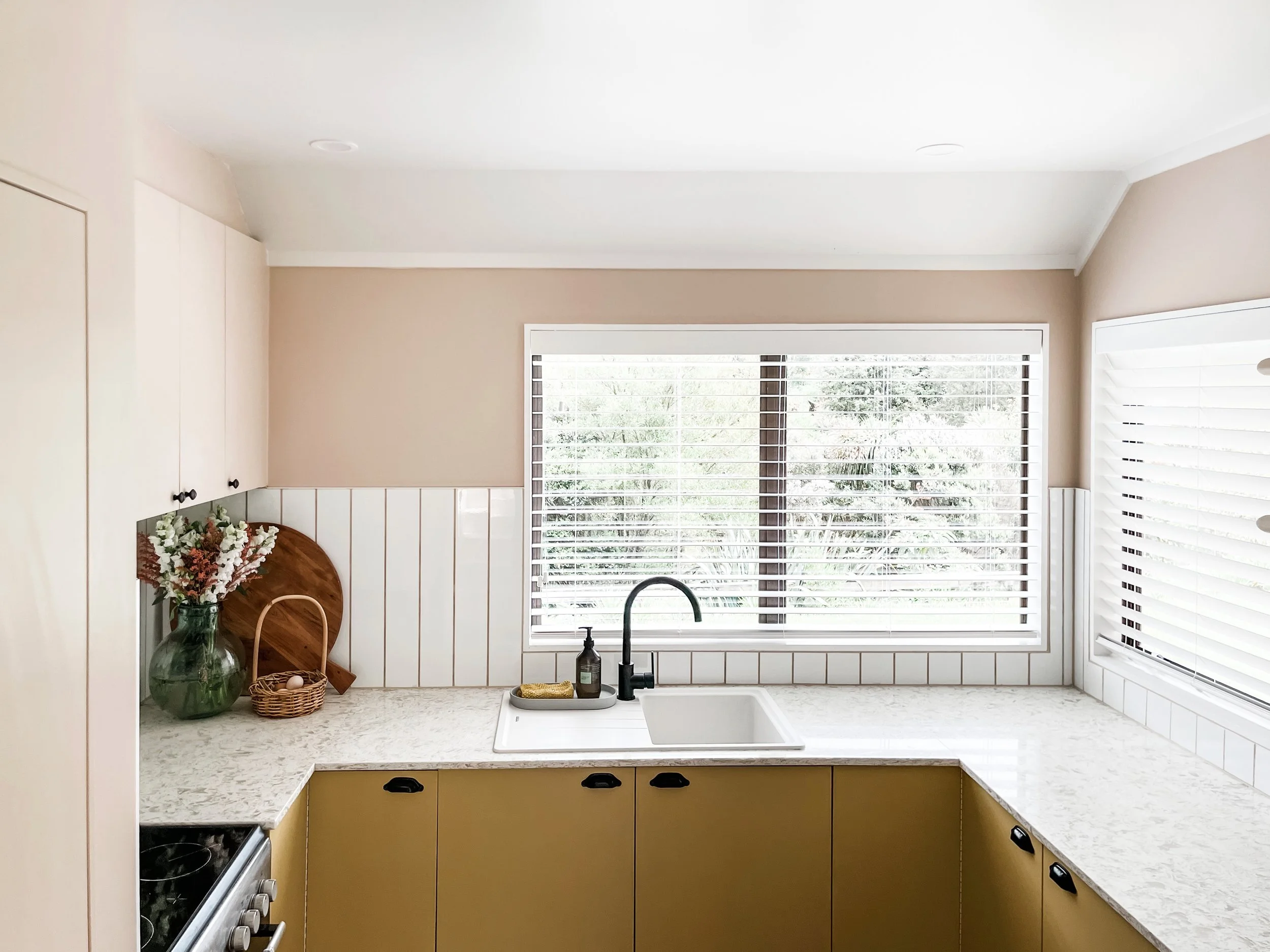
Read MoreOur kitchen renovation started with a very tired, nonpractical, and dated space. The budget was limited but the creative concepts and DIY task list were not! Keeping the original base cabinets and layout, we managed to create a kitchen that looks completely brand new, makes an impact, and is far more functional. Check out our blog that shows you the end result, breaks down the budget and provides a list of all our suppliers and specs.
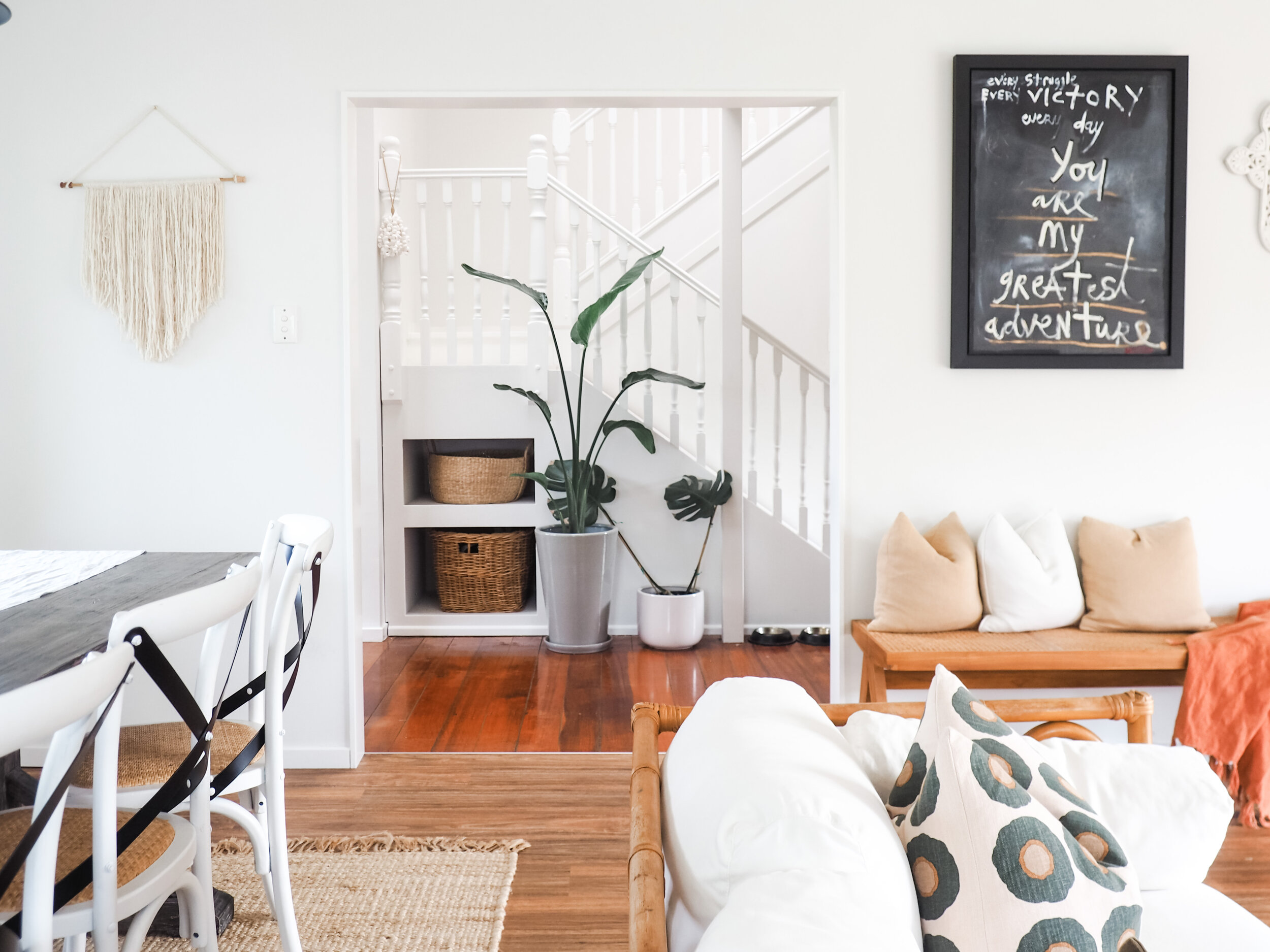
Read MoreWelcome to our living room, the heart of our home and where our “modern farmhouse” style takes its full shape. It is an open plan dining and lounge room that pours out onto our backyard that is surrounded by native bush. With all day sun, a cozy feel and cottage charm, discover how we transformed this space…
Read MoreThis nursery is inspired by natural elements and eclectic pieces. We got creative with furniture and decor to embrace the attic feel of this room with its sloped ceilings and little nooks. Discover how we created this look and styled our nursery…
Read MoreOur master bedroom - it is beauty on a budget! Our makeover has given this space a white and bright look contrasting with our striking panelled feature wall and earthy tones. Discover how we created this look and styled our room.
Read MoreThe design brief in the Christopher’s Master Bedroom was to create his own retreat. See how we took a blank canvas and added colour, texture and comfort.
Read More


