Living in our Lounge
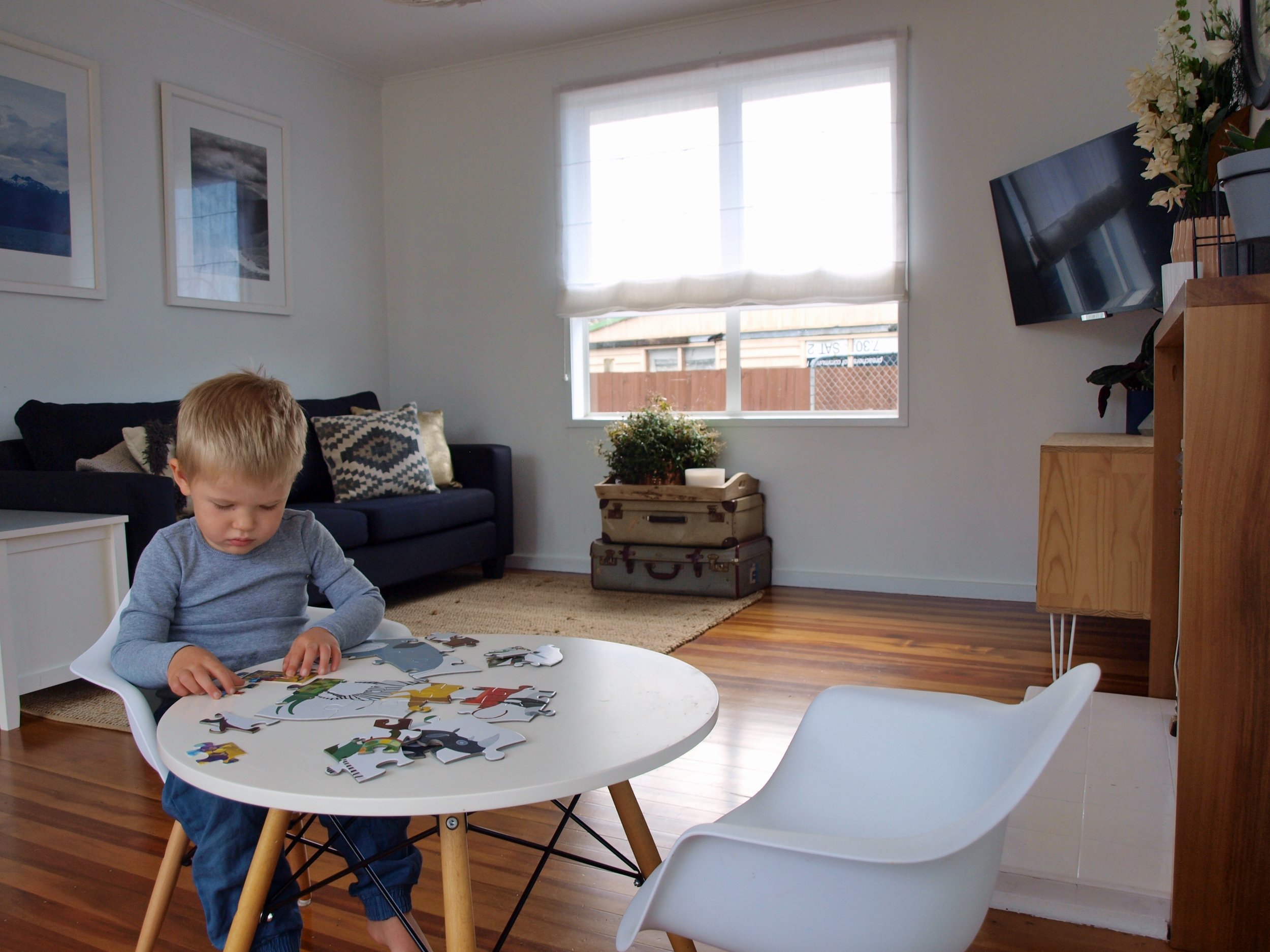
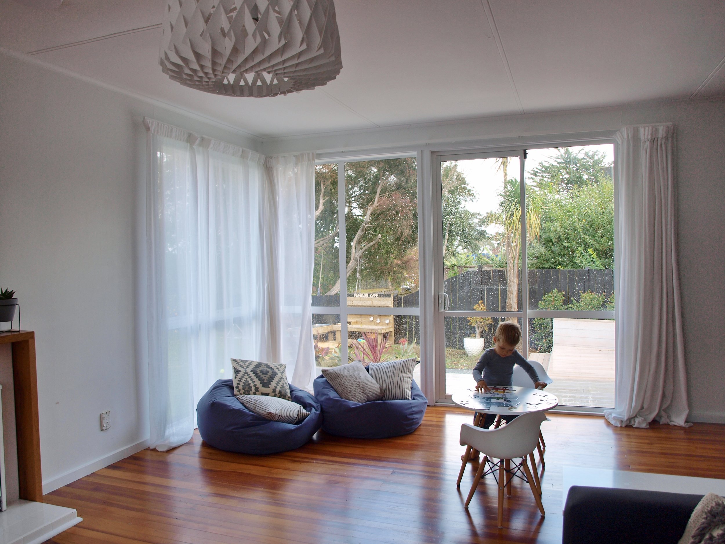
Recently I heard someone making banter about lounge spaces – claiming they had no idea why it was called a ‘living room’. Sure if you have a formal lounge, a family lounge, a kids playroom and entertainment room – the options for living are vast but if you live in our home (or most older homes in NZ) you have one option – the lounge. Our lounge truly is the living room in our house - it caters for our children’s play, our family dance parties, quality TV viewing, hang out with friends and wrestle time with Dad (I’m referring to playtime with Alek in case there is any confusion). For our lounge I focused less on creating a magazine cover look that everyone would be wowed by, rather keeping it simple and flexible, functional for our needs and keeping unity in style with the rest of our open plan dining and kitchen. Interior design is about problem solving and for us our main problem was limited space within a high demand living area – not just for the room itself but the fact the lounge acts as our main entrance from outside and thoroughfare into our open kitchen and dining.
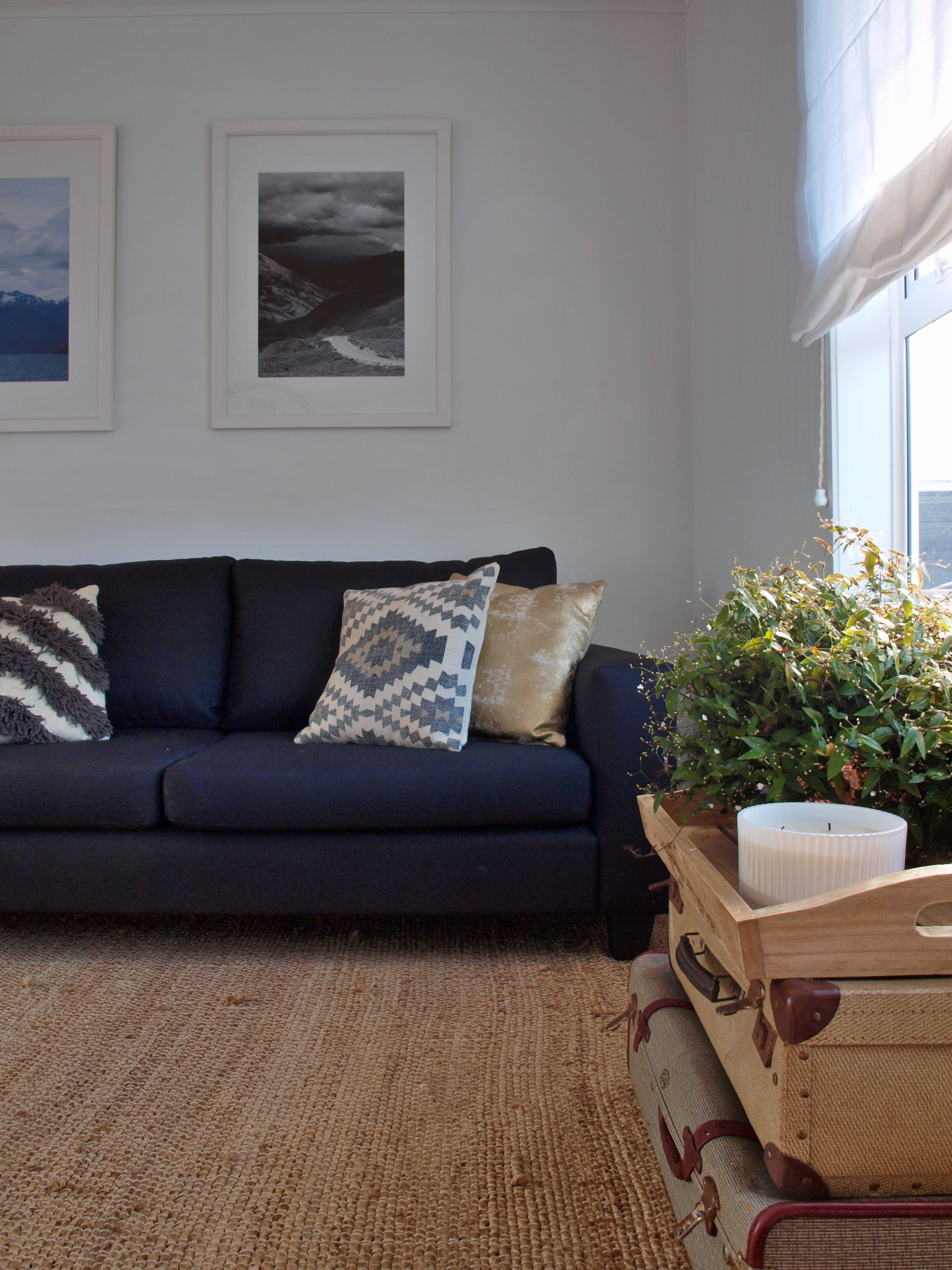
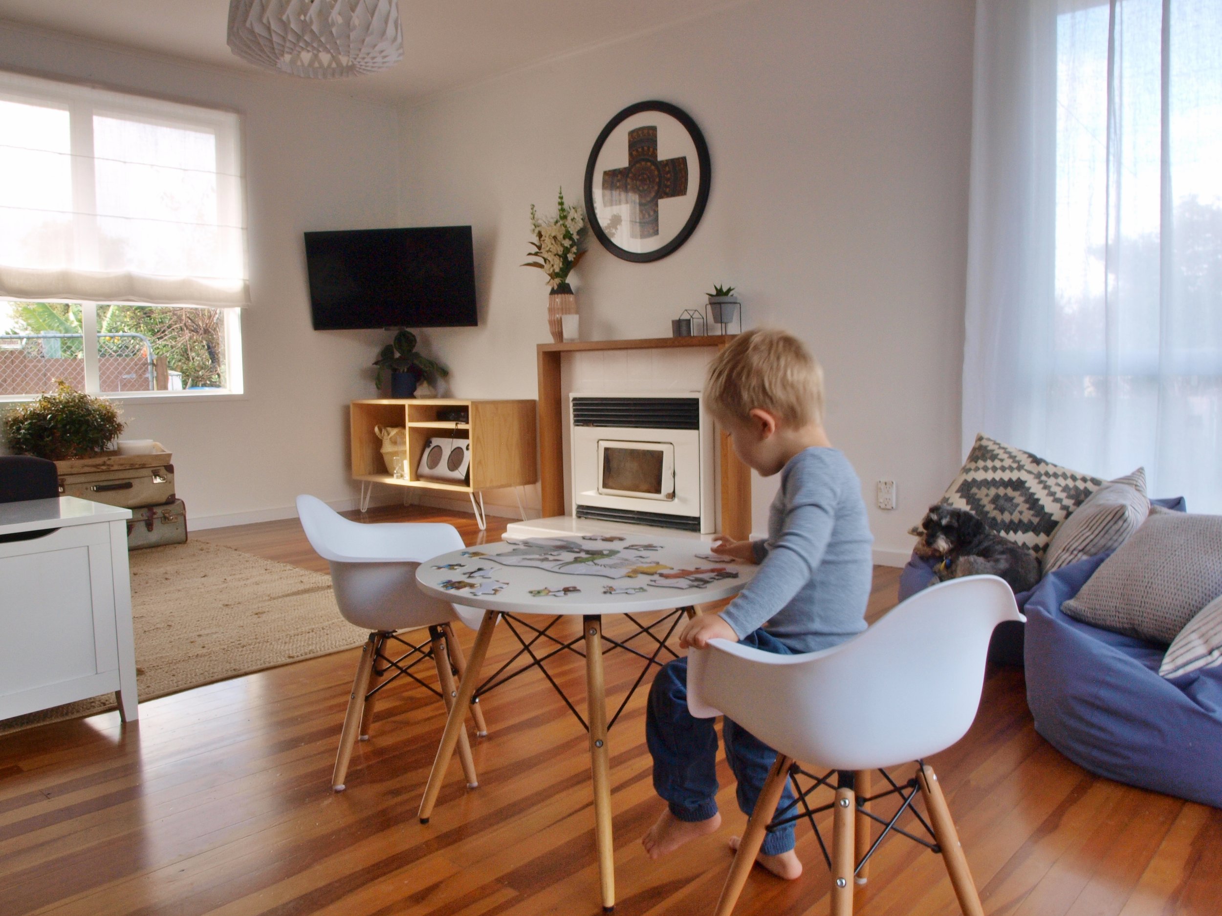
The solution to this was in the layout and furniture placement. We added pieces that would serve many purposes so that furniture wouldn’t dominate the space and created flexibility to provide for who was using the space. We decided we only needed a 3-seater couch and would use beanbags for extra seating. Beanbags are great to get low to spend time with the kids on their level and create flexibility to sit close to the fire in winter and move around when friends come over. We used the children’s toy box as a side table by the couch and opted for no coffee table. This keeps toys accessible, tidy when not in use and the living room open to run around and play.
This design has developed a way of living for our family of shared spaces and created a home that doesn’t over-cater to our needs. It may appear like a lack of seating in the lounge, but we find most of our living is only with our family and our kitchen island becomes the central point for hosting when guests come over. Our lounge has been designed for the 95% of the time we are living in it rather than the 5% when we have people around. When you look at your room and think ‘I need more space’, it may be that you need to create more space within the room you have. For most of us, we can’t gain more space on a floor plan but we can make more workable space within our existing floor plan.
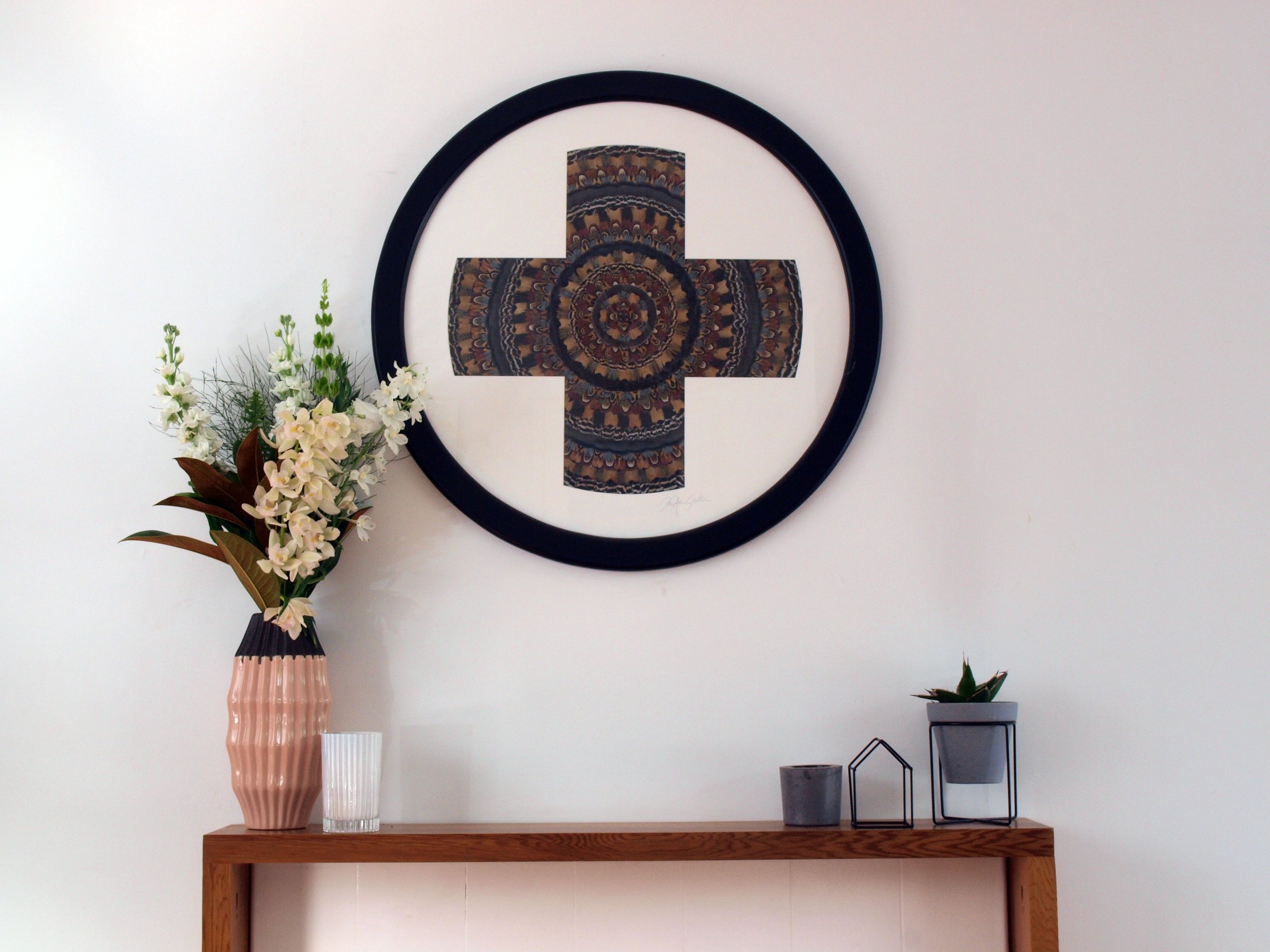
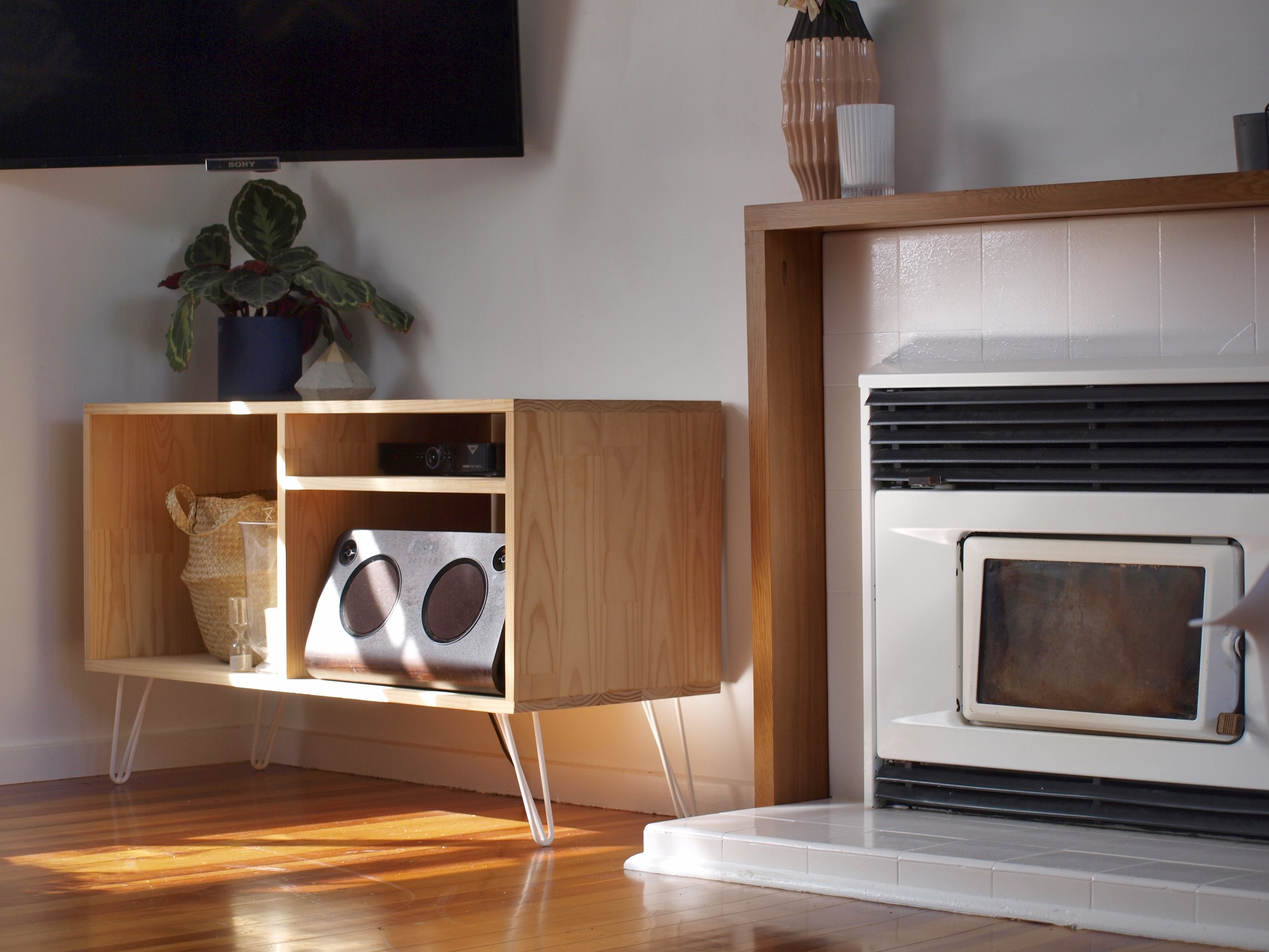
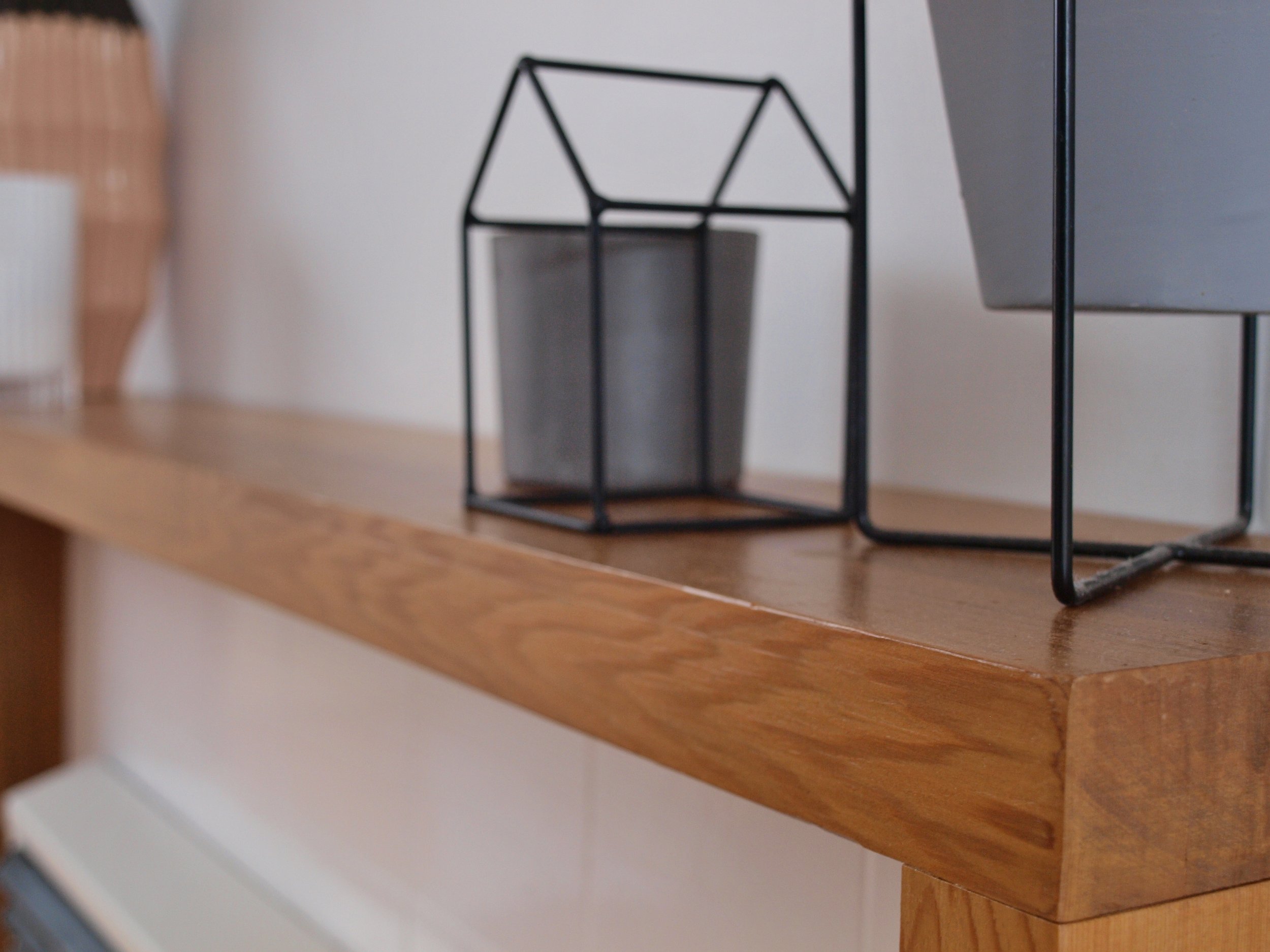
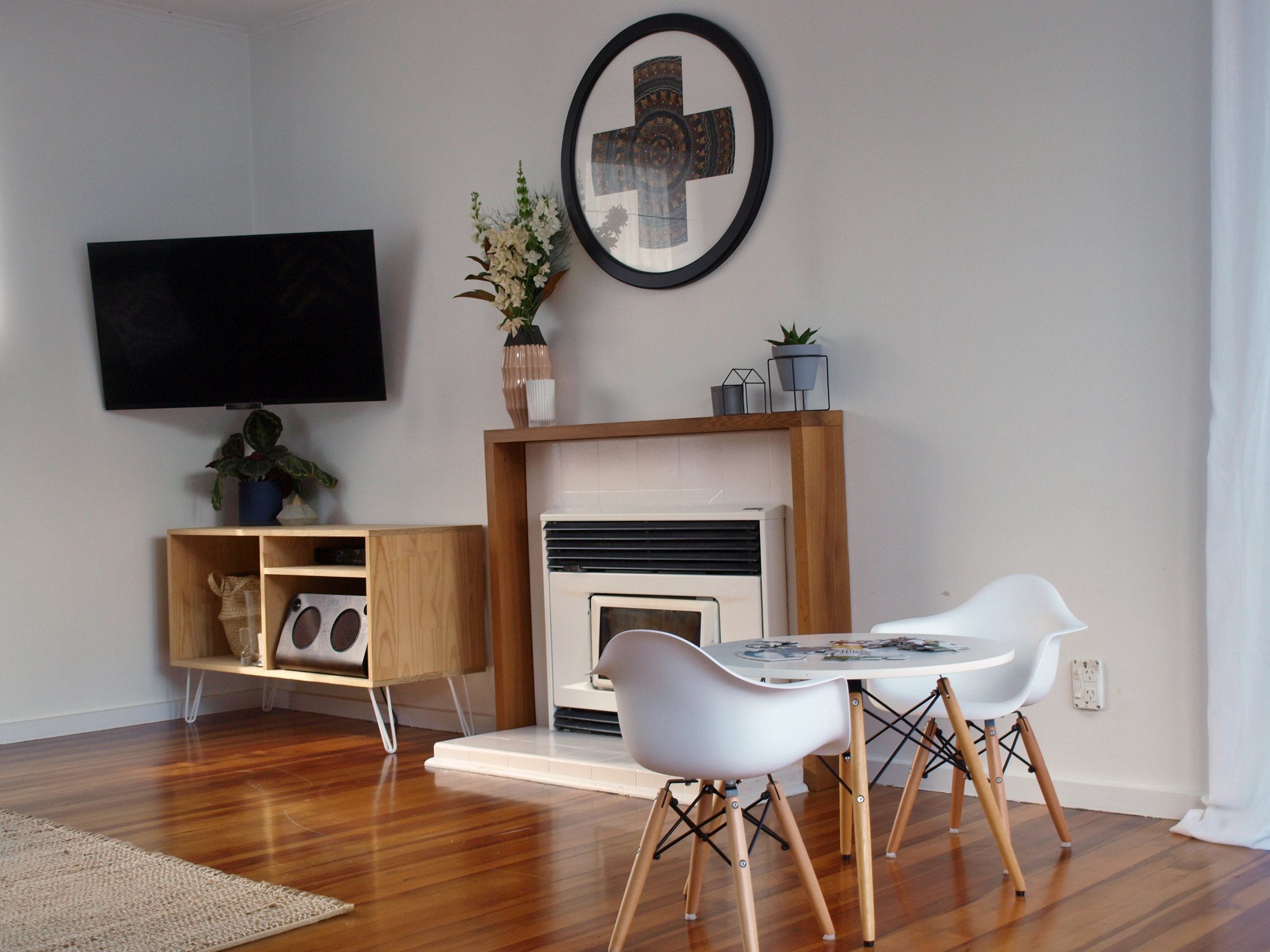
There are some simple design elements in this room I love. We gave the fireplace a quick and low cost makeover by painting the tiles and building a new hardwood mantle. Above the mantle hangs a piece of art titled Mandela Positivity by New Zealand artist Fiona Kerr Gedson, created from pheasant and turkey feathers. It is the first piece of art I have owned and I still find myself sitting and staring at it. I adore our large windows leading to the outdoors that are framed with the simple linen drapes. I picked the white soft drapes from an outlet store and had a custom made roman blind made by 3 Little Birds to match. A feature pendant light to create some depth above the centre of the room, from Eden Lighting. At a practical level the wall mounted tv and outlets we added behind, avoid the common mess of tangled and exposed wires.
Creating your perfect living room is about simplifying your wishlist to what you truly need, catering to those needs by choosing functional and quality furniture and then adding those touches that make the room feel like home.
