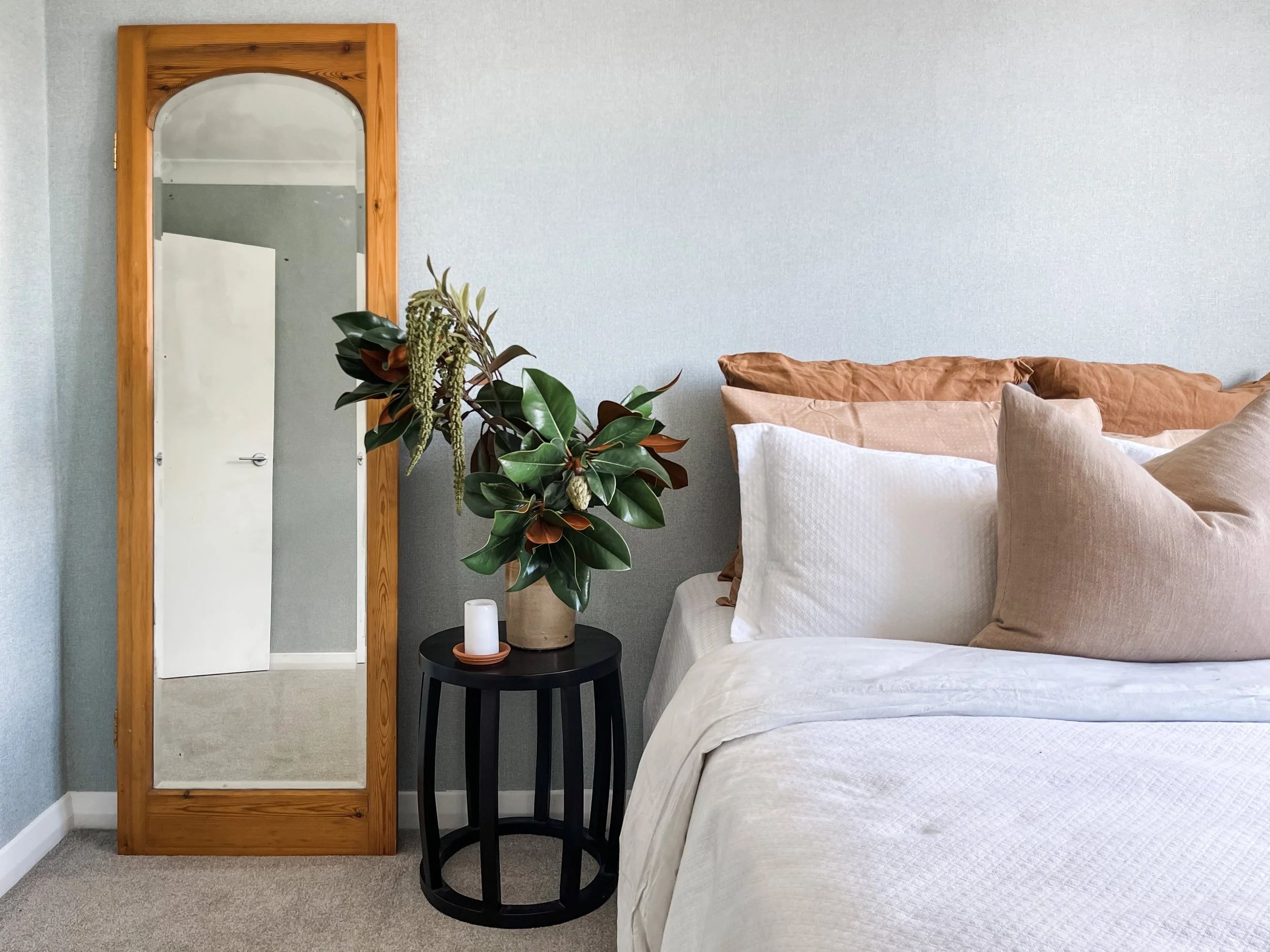
Identical in look and layout, our guest bedrooms have been transformed from a tonal beige nightmare to dreamy, peaceful spaces. Everything is in our blog, from our room reveal video, images of the space, to the breakdown of the budget with links to the products we used.
Read MoreOur lounge is situated at the front of the house and looks out onto the front yard. It is a room with large windows and a wood burner fireplace, it just needed to have an updated look that was comfortable and practical. With all the other living areas at the back of the house, we created a formal lounge that is a combination of old world design with a new world twist. Discover we renovated this space…
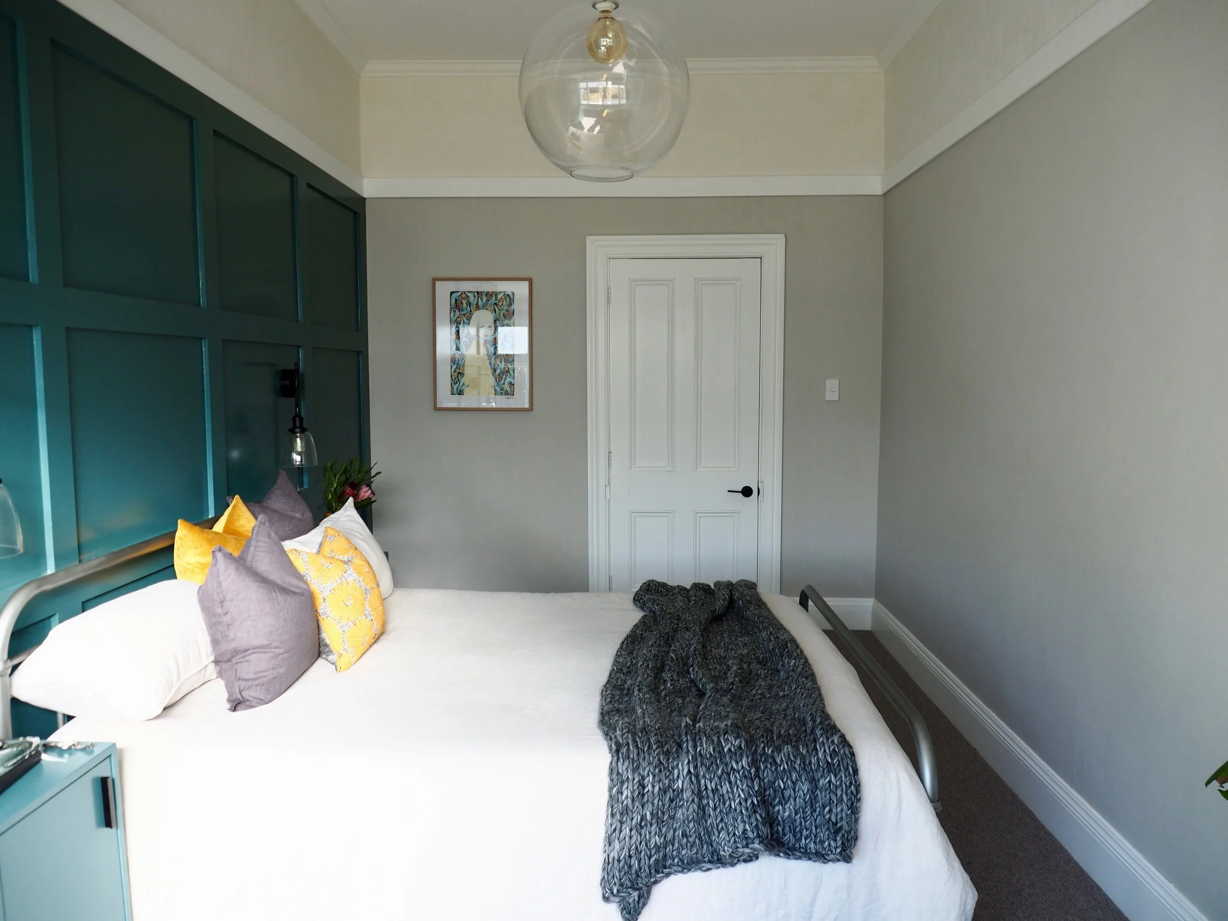
Read MoreOur original master bedroom came with challenges - two different ceiling heights, a wardrobe in front of a window, a power plug from the spa bath sticking out of the wall! The long and narrow shape of the room meant we had to be intentional as we designed and problem solve the poor renovation choices we had inherited. We took a space that felt problematic and created a space that feels bold and sophisticated. Discover how we made it happen…
Read MoreOur guest bedroom renovation was all about giving this space a distinct look with bold design. We took a room that blended into the rest of the house to a show stopping zen retreat! See our reno recap to discover how we did it…
Read MoreOur Kids Bedroom renovation was all about taking a dull, dark, cream coloured space and making it full of texture, warmth and colour. Watch our full reno recap to see how we designed, renovated and styled our Kids Room in our Diamond in Richmond Project.
Read More


