Working with what you have can sometimes be a challenge in a renovation when you have a bathroom layout that doesn’t utilize space and laundry that can barely fit a washer and tub. But both the bathroom and laundry only had the budget for a cosmetic makeover, meaning nothing structural was changing. So everything about this renovation is about problem-solving space solutions and restoring the potential of what we already had. In this blog, we share images of the end result, as well as a breakdown of the cost for every detail we added.
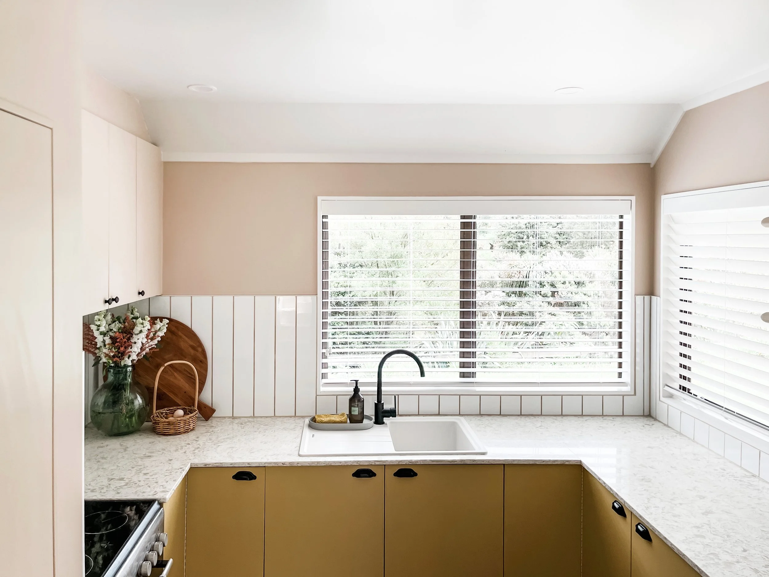
Read MoreOur kitchen renovation started with a very tired, nonpractical, and dated space. The budget was limited but the creative concepts and DIY task list were not! Keeping the original base cabinets and layout, we managed to create a kitchen that looks completely brand new, makes an impact, and is far more functional. Check out our blog that shows you the end result, breaks down the budget and provides a list of all our suppliers and specs.
Read MoreThe backyard of our Farmstead Cottage was renovated with a desire to create an extension of our house in the outdoors. Even with a limited budget, we managed to create a kids play area, a dining space and a deck. In our room reveal blog, see all of the reveal images as well as the details of what products we used.
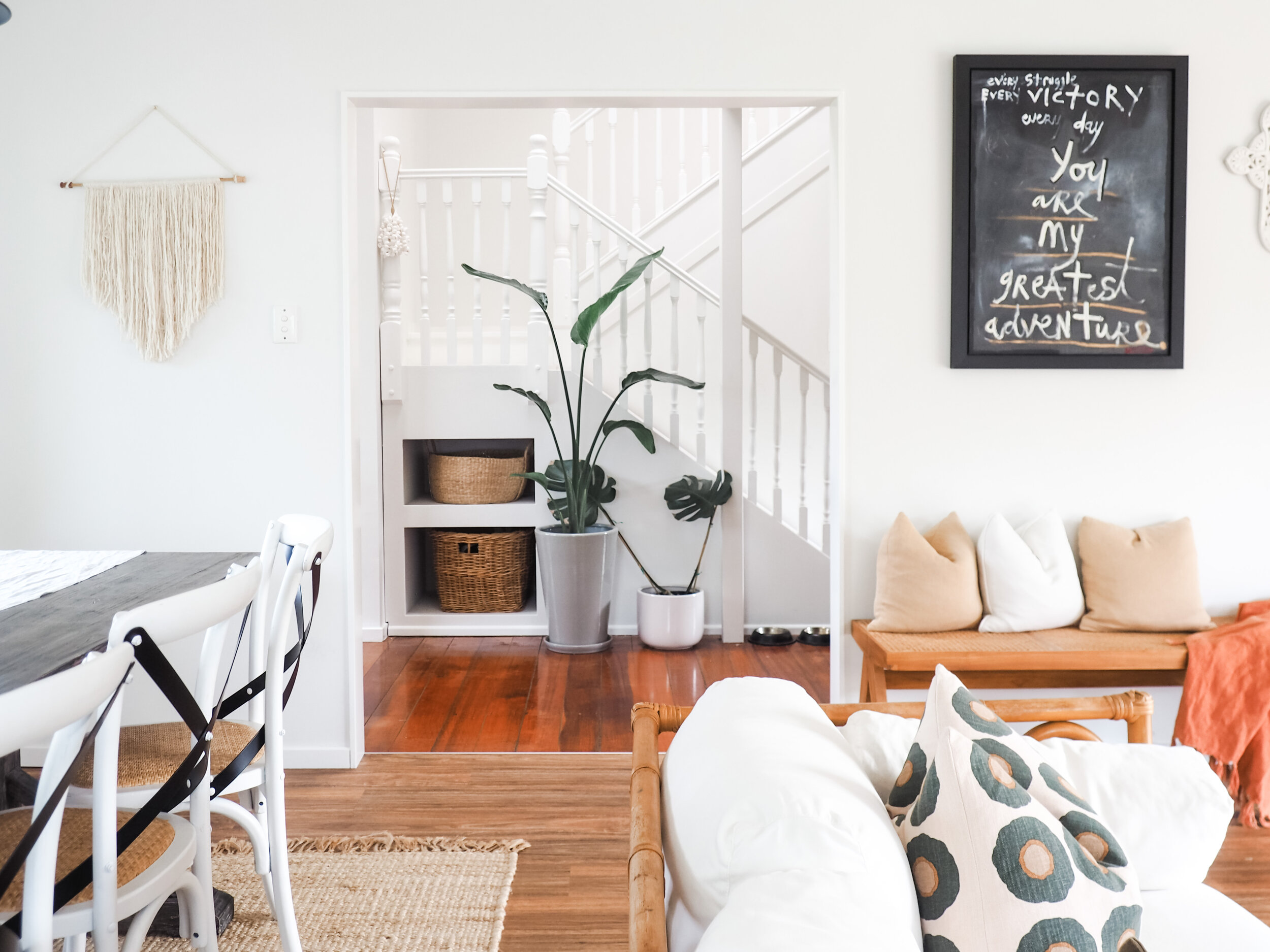
Read MoreWelcome to our living room, the heart of our home and where our “modern farmhouse” style takes its full shape. It is an open plan dining and lounge room that pours out onto our backyard that is surrounded by native bush. With all day sun, a cozy feel and cottage charm, discover how we transformed this space…
Read MoreThis nursery is inspired by natural elements and eclectic pieces. We got creative with furniture and decor to embrace the attic feel of this room with its sloped ceilings and little nooks. Discover how we created this look and styled our nursery…
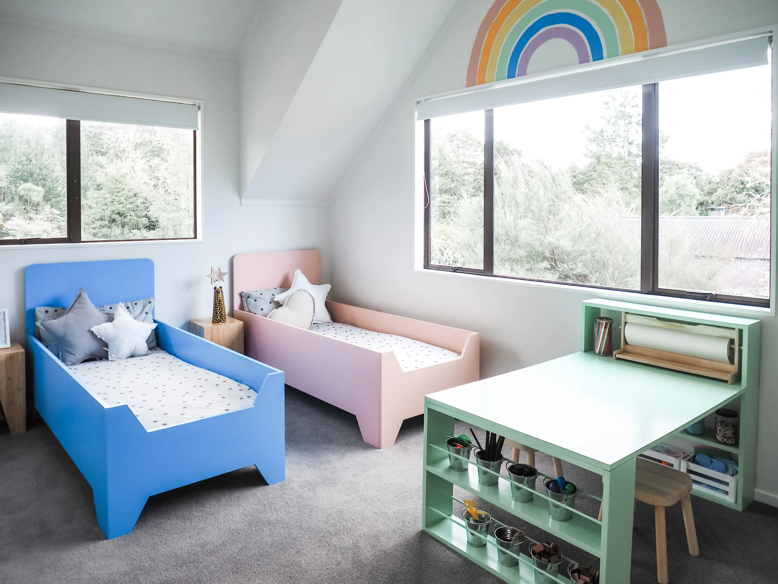
Read MoreOur kids bedroom in our Farmstead Cottage is all about colour, a shared space to sleep and play and storage. Our minis wanted a rainbow room and so we transformed the original dated sloped attic room into a white, bright and colourful bedroom. Discover how we created this kids bedroom that is full of custom made pieces and all the comfort our kids need…
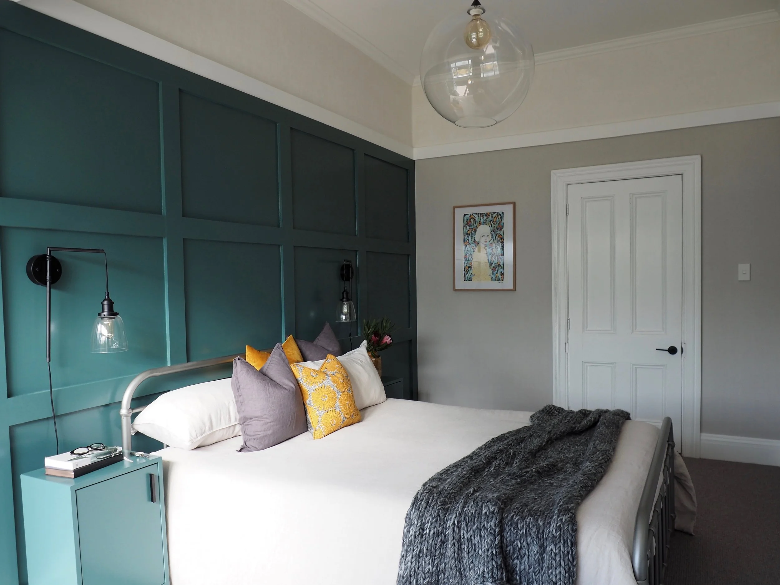
Read MoreOur master bedroom - it is beauty on a budget! Our makeover has given this space a white and bright look contrasting with our striking panelled feature wall and earthy tones. Discover how we created this look and styled our room.
Read MoreThe plan was to create an outdoors space with a focus on entertaining and dining, that can be used year round. A big deck that will flow from the dining space, for entertaining outside. Covered with a pergola, so it feels like an extension of the dining room. A paved area for a more casual and relaxed outdoor space. And then a lawn - to make sure there is plenty of green and great for kids to play on.
Read MoreDesigning and installing the kitchen ourselves meant we created a kitchen floor plan that worked for our unique space and the style we wanted to achieve. We added bench seating off the back of the kitchen into the dining space, as well as a booth at the far end of the dining room to make it a family space. When we purchased this house, this space our least favourite in the house, now it is our favourite. Goes to show - the spaces that are problematic can cause you to design at your best!
Read MoreRenovating your bathroom is one of the most complicated spaces in a house - while with other spaces in your house you can develop ideas and add features as you go – bathroom design needs to be final before any walls are lined. All of your hardware need to be onsite ready to go so your tradies can install all the services and fixings in the exact locations before lining the walls. You need a clear idea of the look you want to create and ensure you select the right products for your space.
Read MoreFrom the first time we spotted this house’s listing, it stood out. Built by a local builder in 1910’s, it was full of potential – a flat faced villa with a central hallway, high studs, and the lean-to extensions added over her 100-year life. From the front veranda, you can look out to the Richmond Hills and enjoy all-day sun. This renovation was all about enhancing the heritage of the villa, while still giving it some modern features.
Read MoreIt is truely a privilege to be able to give new life to a house with so much history. The design and workmanship of the last century is still impressive today, so the objective of the design in our lounge was to add elements that enhance the features of the old villa while still giving it a fresh modern look.
Read MoreOur Master Bedroom in our Diamond in Richmond has some of our boldest design choice we have made in a bedroom! Wall panels, integrated wardrobe wallpaper, feature lighting and patterned drapes, this room has it all! Discover the full room reveal and all the products we used here…
Read MoreWelcome to the Japanese room, inspired by our wallpaper that has adapted iconic symbols of Japanese culture. We decided to fully embrace a Japanese theme, adding elements of simplicity, minimalism ad nature into the interior design. In interior design, Zen reflects balance, harmony and relaxation - see how we created that look!
Read MoreOur laundry space, a separate dwelling to our house, had a lot of potential and plenty of space to work with. We wanted to create a multipurpose room that housed a beautiful laundry but could be hidden away when it wasn’t in use
Read MoreCreating spaces for our little humans is always a treat - it’s a chance to create an environment for our kids to play, relax, make mess and sleep. Did I mention sleep… because they are so cute and behaved when they do that! And as much as we aim to design rooms they love, we want to love it too because majority of the time - we spend as much time in there as they do!
Read MoreIn Christophers open plan lounge space the main design brief was to add plenty of space for mates watch sport on a big TV! See how we gave his lounge an industrial look that complements the rest of the open plan space.
Read MoreThe design brief in the Christopher’s Master Bedroom was to create his own retreat. See how we took a blank canvas and added colour, texture and comfort.
Read MoreDiscover how we took Christopher’s brand-new open plan kitchen and dining space with light laminate floors, light grey walls and cabinetry and added his own interior style.
Read More